Pantone Color Institute Declares Red Will Headline the Fall Palette
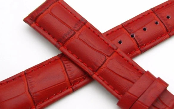
We haven’t even hit spring yet and the Pantone Color Institute has already named its fall colors. The Institute has taken its cues from the runways of New York and Paris to create a color palette that will serve as a reference throughout the rest of the year for fashion enthusiasts, reporters and retailers. That means we expect to see some nice red watch straps this fall for men and women alike.

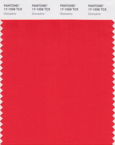
According to the Fall 2017 Fashion Color Report, an annual overview of fashion designers’ use of color for the season, the hot hues will be sizzling Grenadine Red, Tawny Port, and autumnal hues. Pale pink Ballet Slipper — a hue that borders on nude — will also be important.

Secondary colors include Navy, Neutral Gray, Butterrum and Marina Blue. The Institute analyzed collections at both New York and London fashion weeks to determine the trending colors.
“There is a commonality between the colors we are seeing on the runway in New York and London,” says Leatrice Eiseman, Executive Director of the Pantone Color Institute. “However, individuality is evident and we are seeing a distinct difference between the shows in the two cities in the way these same colors are being combined.”
Color Palette for New York
“Bookended by a dynamic Grenadine red and a tawny Autumn Maple, the color palette for Fall 2017 leans more to warmth,” Eiseman noted in reference to the trends seen in New York. “Standout shades include a pale pink Ballet Slipper, a refreshing Golden Lime and a bright Marina blue. These hues add a striking touch when paired with the classic autumnal shades of Navy Peony, Neutral Gray, Butterrum and Tawny Port.”
- PANTONE 17-1558 Grenadine
- PANTONE 19-1725 Tawny Port
- PANTONE 13-2808 Ballet Slipper
- PANTONE 16-1341 Butterum
- PANTONE 19-4029 Navy Peony
- PANTONE 17-4402 Neutral Gray
- PANTONE 19-4524 Shaded Spruce
- PANTONE 16-0543 Golden Lime
- PANTONE 17-4041 Marina
- PANTONE 17-1145 Autumn Maple
Color Palette for London
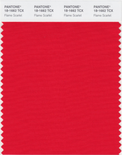
“Led by a vivid Flame Scarlet, the color palette for Fall 2017 is comprised of strong classic colors complemented by a few unpredictable shades for the autumn and winter seasons,” Eiseman said in reference to the London trends. “Unexpected combinations, such as Royal Lilac and Otter Brown or Lemon Curry with Bluebell, are eye-arresting and create an unusual color dichotomy.”

- PANTONE 18-1662 Flame Scarlet
- PANTONE 12-2904 Primrose Pink
- PANTONE 16-1331 Toast
- PANTONE 14-4121 Bluebell
- PANTONE 18-3531 Royal Lilac
- PANTONE 18-1018 Otter
- PANTONE 19-4029 Navy Peony
- PANTONE 16-1338 Copper Tan
- PANTONE 15-0751 Lemon Curry
- PANTONE 16-0639 Golden Olive
